


In this day and age where a business’ visual presentation is of the utmost importance, one must be very thorough and possess a unique talent for effective visual marketing. And what better way to do so than by the simple use of colors.
Now colors, believe it or not, play a major part in ensuring that your brand and signage would have massive effect. However, it can also serve as a major drawback. Especially if you put personal preferences in the planning. It can even pull your business down if you mismatch colors with its intended business nature. A good example would be this. Say you’re opening a convenience store and you use your favorite colors purple and black as your branding colors. Now that’s a bit off since purple and black are often used in marketing luxurious and expensive products. A convenience store often uses colors such as white , blue , red and yellow to denote trust, urgency and attention, something customers look to when going to a shop.
So without further ado, here are a few ideas on how colors can affect the business’ signage and tips on how to incorporate them in your business.
1. Warm Cool and Neutral
Colors are divided into three psychological groups namely Warm, Cool and Neutral Colors.
Warm colors tend to gravitate towards red, yellows and oranges. These colors are often used in fast food businesses. Reds and yellows are also used to denote a sense of urgency especially during sales.
Cool colors, on the other hand, gravitate towards greens, blues, purples and the occasional whites. They are often used in banks, professional service businesses such as laundromats and even resort logos.
The neutral colors compose of blacks, whites, grays and browns. These colors are commonly used nowadays in coffee shops, specialty shops and luxurious shops.
Bear in mind that these are just some classic examples and you can easily take inspiration from it when choosing your signage colors.
2. Emotion and Association
Believe it or not, colors have a very interesting effect on the marketing signage in terms of emotion and association, for example, if your signage has white and light blue colors, people will feel physically cold and will associate the signage with anything related to ice or winter. A signage with green and yellow often denotes healthy living and will often be associated to leaves and fruits.
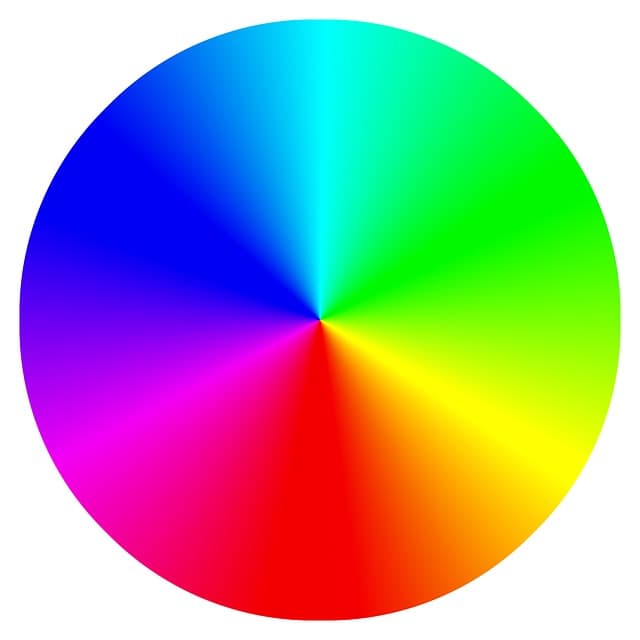
Colors have often tapped into this aspect and many color experts have observed and created studies based on these. Here is a chart based on these studies
RED – creates urgency, energy, excitement, speed, warmth often associated with fire and food- often seen in sales signages and fast food business such as Wendy’s and McDonalds and occasional shops like K mart.
ORANGE – creates energy, happiness, stimulation, food, creativity, affordability, aggression –this is seen in fast foods, impulse buying and the need to push for action such as Payless and Amazon
YELLOW – attention grabbing, liveliness, hunger, energy, summer, comfort, intellect, happiness- often seen in fast foods, summer related signages. Yellow is also used in signage fonts. Good examples are Best Buy, Ikea, Denny’s and UPS
GREEN – creates ease, calmness, reliability, environmental, relaxation, spring, honesty, durability, freshness, optimism – often use to give a sense of relaxation to the market and health and reliability. Good examples would be Starbucks, Sprouts Farmers Market and the Dollar Tree Store
BLUE – creates trust, professionalism, loyalty, reliability, honor, stability, coldness – often seen in financial institutions such as the banks , credit cards like Visa and Pay Pal and even homegrown businesses like GAP, Ross and Walmart
PURPLE – creates calmness , a sense of power, nobility, elegance, sophistication, luxury, mystery, magic, royalty – these are seen in expensive perfumes and brands like FedEx Corporation and Cadbury
BLACK – elegance, formality, strength, power, sophistication – this is seen in signages like Salvatore Ferragamo, Chanel and Versace
3. When in doubt, seek a professional

With all these in mind, it may overwhelm you. Especially if you still can’t decide which colors will help you with your business signage. Not to worry. There are professionals who can help you. A marketing professional is the best person to go to.
A good example would be Spot Color Marketing, based in Portland, Oregon. They have the talent and experience in web design and have amassed enough expertise in helping you choose which colors best represents your brand and business. All you need to do is tell them the nature of your business and they will create various studies and propose color schemes that will best fit your niche’.
Colors are great especially in promoting a business. But with the right amount of consideration and visualization, you can create the perfect scheme to promote your business with the sure fire way of leaving a lasting impression on your customers.